First, we need to familiarize you with the CSS Box Model.
Skip to the quiz in the next section if you already know the box model
CSS Box Model
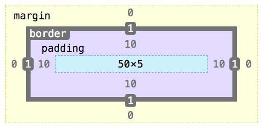
The box model describes the basic structure of one html element. Note that this is not to scale, so the pixels do not match up in the image!
- The blue dotted box is the
width x heightof the content in the html element - Purple space is padding in the html element that surrounds the content with empty space
- Border is the line around the html element. Used to set a border around the element.
- Margin is like padding (empty space) but goes outside the border — determines space between elements.
Understand? Good you’re ready for the quiz
Quick CSS Quiz
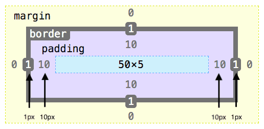
Imagine that a you have a div with a width of 50px, height of 5px, a 1px border, and 10px of padding all around it.
What is the total width of this div, including the border and padding?
⏳
⏳
⏳
⏳
⏳
⏳
Answer: 72px
To get that answer you had to start with the width of 50px add the left-side and right-side of the border for 2px and lastly add the left-side and right-side padding for 20px.
But it doesn’t have to be this way!
Why did we need to make all these calculations to measure a simple width of a div? Why can’t the css width actually refer to the width of the div?
Well there is another box-model we can use!
Introducing: box-sizing css property
First, I’ll go over the default value for box-sizing, which is content-box. Then I’ll go over the alternative setting, border-box!
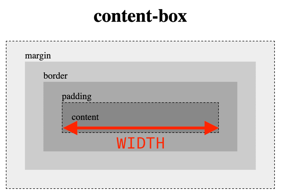
In short, with content-box the width and height properties in css refer to the width and height of the html content, not including padding and border.
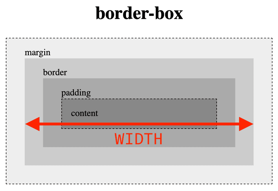
With border-box the width and height properties refer to the total width and height of the html, which includes the padding and border.
content-box (default)
If box-sizing: content-box property is set, the width and height property only applies to the content section. The resulting width of the entire html element is 72px, including the extra 20px from padding and 2px from the border. And the resulting height is 5px.
✨border-box ✨
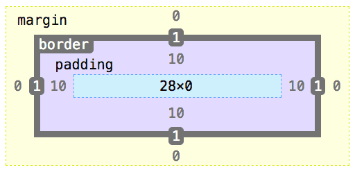
If box-sizing: border-box property is set, the width and height property is applied to the entire element. The content section is calculated after including the padding and border so the width of the entire child element is 50px with a content width 28px, padding of 20px and 2px of border. The height of the content is now calculated to be 0 because the 10px padding on top and bottom satisfy the 5px height requirement.
Playable CodePen
I made demo in CodePen! Feel free to open up the inspector and see the changing width.
When the box-sizing property is set to content-box, the width is 72px.
When the box-sizing property is set to border-box, the width is 50px!
https://codepen.io/abdisalan/full/NWqNYgJ
History
Of course you can’t talk about the history of the web without mentioning Internet Explorer.
The border-box model, where the width and height include the padding + border, was used and popularized by Internet Explorer. In contrast, the world wide web consortium (W3C) have decided that the content-box model is the standard and is currently used and the default for most modern browsers.
Which do you prefer?
I personally prefer border-box, but they each have their pros and cons. Tell me which one you prefer on twitter!
border-box— You don’t have to think about adding padding or border, they do the calculation for you and it’s supported by older browsers.content-box— Default behavior in most browsers. Lets you dictate the size of the content so it might be easier to fit other elements within.
If you want to include border-box in your next project, you can use this handy CSS rule to apply it to all your elements.
* {
    box-sizing: border-box;
}
Hope you enjoyed this post and you start using border-box in all your projects!
✌️
